This is design #1, a business flyer.

Evaluation of Above Design
For my business flyer, the visual appeal is great. The bright colors are eye-catching and this flyer could be seen from a bit away. Some of the text might be a little difficult to read, but overall, the contrast is just right. From the flyer, you can't tell exactly what is being sold; is it baked goods, or just cupcakes? All of the important information is included on this flyer: address, hours of operation, and even a special deal to increase sales. I could have chosen a picture to better represent the sale, or the wider variety of the baked goods, for that matter, but I chose cupcakes as a kind of basis for the business "Cole's Bakery."
As for the design elements, my use of lines is very simple: alternate text locations from side to side, in order to create a mini feel of balance. In order to break up the monotony, I placed a line at an angle in comparison to the others. The picture overwhelms the flyer, but seeing as I felt that is the most important object to grab attention, I left it that way. Admittedly, there is not a sense of unity in my flyer, due to the simplicity of such an object. It feels as though my eyes just jump from one text blurb to another in order to catch the message.
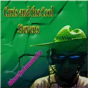
This is design #2, a music CD cover. This is the front cover.
This is the back cover.
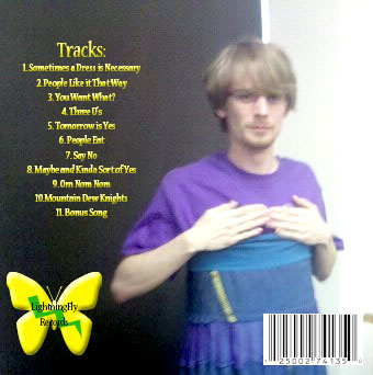
Evaluation of Above Design
For my CD cover, the visual appeal is nice. The front cover is typical of any CD cover. One gets a picture of the artist, the name of the artist, and the title of the CD. It might also be difficult to read some of the text on the front and back cover, but one can still tell what it says, because the font contrasts with the background picture in a way that it isn’t difficult to read because of the font color. Unfortunately, one cannot tell whether or not it is a band or just a single artist, because the name contrasts with the pictures. By this, I mean that you only see pictures of “Chris” and none of the “Cool Stevens”.
As for the design elements, it was very simply done, yet the picture of “Chris” on the front cover is slightly off color, perhaps mixing into the rest of the background too much and not providing enough of contrast. The back cover is also simply done, and one part of it does not overwhelm the rest of it. There is a sense of unity and balance. There is a sense of harmony in the two covers. Nothing clashes to the point of making it seem as if I just threw it together.
This is design #3, an advertisement.
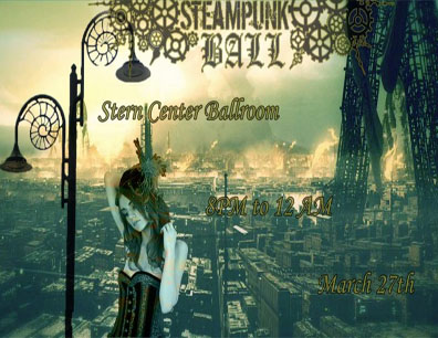
Evaluation of Above Design
For my advertisement, the visual appeal is also great. The colors may not be bright, but the advertisement as a whole is very eye-catching. Parts of the text may be hard to read, as with my other designs, but the overall idea is clear. You can tell all the important information from the advertisement, such as what is going on and where it is going on. Sadly, one important feature is missing: who is holding the event. Nonetheless, the pictures are unified and do not conflict with each other. Another feature that is missing is the dress required for the ball. For this ball, even though it does not say it on the advertisement, we asked people to dress in Steampunk attire or formal attire.
As for the design elements, the advertisement has unity and harmony. Nothing conflicts to the point where one cannot understand why it was made. There is also balance, because the text and pictures do not seem cluttered together; there is enough distance between each part so that balance appears. To break up the monotony of the text, I changed the text of the event itself (Steampunk Ball) so that it appeared as important as it is.
This is design #4, a company logo.
Evaluation of Above Design
Lastly, for the Green Acres Landscaping logo, I feel as if it is simple, yet effective. Obviously, due to the tree, this is a logo for a landscaping or gardening, or some type of "green" job. The creativity factor is low, due to the simplicity of the type of company logo I was aiming for. It is effective in giving the message that it is a landscaping company, yet again, due to the tree. The picture is readable from many distances, which is necessary for a logo of a business. The colors and tree, from a distance, give the idea of what the business is.
In regards to the design elements, there is no straight horizontal line on the logo creating a less dull image. The pairing of the relatively large tree with the smaller text adds a sense of depth while leaving some viewing space and creating balance. There is no repetition to create a monotonous feel, yet there is harmony between the colors and shapes. The larger tree also creates dominance, drawing your eyes to it as a kind of "genre" for the logo. Seeing as there are only two objects on my logo, the unity is low, yet effective. The viewer's eyes do not have to move much to go from the topic, the tree, to the body, "Green Acres Landscaping."